Neon signs are beloved by those who grew up with them because they are bright, evocative, and can be seen from a long distance. During the 1920s through the 1950s, these brilliant gases were widely used, and not just in restaurants, motels, and billboards.
Neon signs are commonly used for advertising (in all kinds of contexts), as well as for special occasions and as part of home decor, due to their striking appearance. The font used in creating a neon sign is an important factor in its overall effectiveness. In terms of making a sign that sticks in people's minds, picking the right font is crucial.
This article will go over some of the most effective fonts for neon signs and how to pick the best font for your project. This blog will equip you with the skills necessary to design a visually stunning and effective neon sign, whether you need it for a business, an event, or your own personal use.
What Is the Significance of Font in Neon Signs?
When designing a one-of-a-kind neon sign, it's crucial to start with the right lettering. The sign's readability and memorability can both be improved by using a font that works well with the sign's message. The effectiveness of a sign can be diminished if the font chosen is inappropriate (too small, too difficult to read, or just plain ugly).
For stores that rely on signage to draw in customers, this is crucial. A high-end boutique, for instance, may go with a more formal and sophisticated typeface, while a coffee shop may go with something more casual and approachable to convey the fun and friendly nature of their business.
The font should also be legible from a distance and in different lighting.
Choosing the appropriate font is crucial if you want your sign to be read and remembered. Carefully considering what font to use for a custom neon sign can help businesses and individuals make a sign that is both functional and visually appealing, and one that truly conveys the intended message or personality of the sign's owner.
What Are the Best Fonts for Neon Signs?
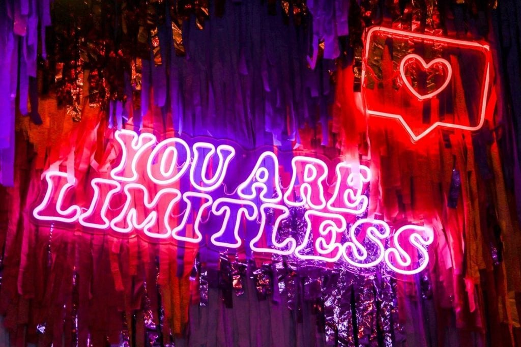
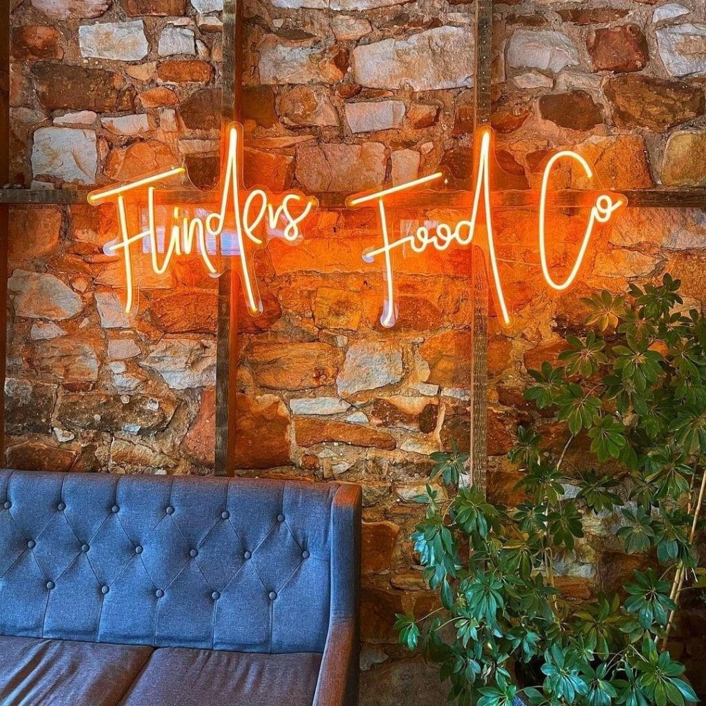
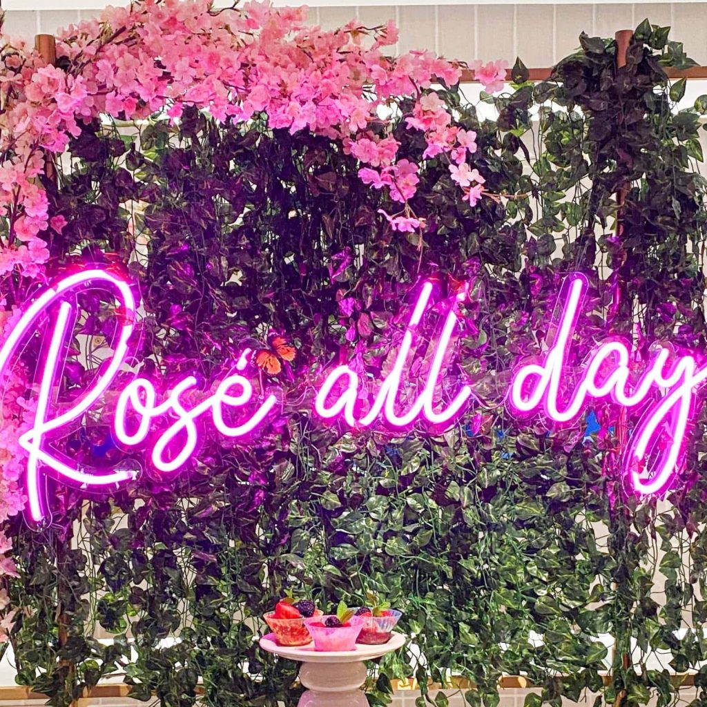
Neon signs can be made using a wide variety of fonts, each with its own distinct look and feel. Script typefaces like Pacifico, Lobster, and Brush Script are perfect for neon signs because of their fun and sophisticated appearance.
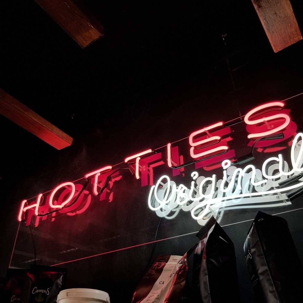
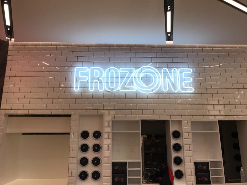
Signage, especially for businesses or events, can benefit from using blocky fonts like Impact, Bebas Neue, and College to make a strong visual statement.
A traditional neon style is available in fonts like Neon Tubes, Neon Glow, and Neon 80s, which can be useful for brands who want to appeal to a nostalgic audience.
To make a sign more friendly and approachable, handwriting fonts like Aesthetique and Dear Joe 5 Casual can be used.
Message, audience, and environment must all be taken into account when selecting a typeface for a neon sign. The appropriate font choice may help you design a neon sign that is both eye-catching and successful in conveying the message you want to send about your business, event, or even your own unique sense of style.
Best Neon Sign Fonts for Business or Events
Certain fonts are better suited for use on neon signs than others, whether for a business or an event.
Blocky and bold fonts like Bebas Neue, Impact, and Helvetica Bold are great for creating a powerful and memorable design for businesses, making them suitable for use in storefronts, logos, and promotional signage.
High-end stores and luxury brands may benefit from the refined look that script typefaces like Pacifico, Lobster, and Brush Script can provide.
Neon Tubes, Neon Glow, and Good Vibes are great for creating a joyful and lighthearted environment at events, while Rusty Cola Pen and Cooper Black are great for evoking a vintage or retro feel. Always think about the brand messaging or event theme when deciding on a font for a business or event.
In order for the sign to be easily seen and understood by passers-by, it is also crucial that the typeface be legible from a distance and under varying lighting circumstances.
Best Neon Sign Fonts for Indoor

Some fonts are more suited for indoor neon signage than others.
In a professional or business context, Avenir, a clean and modern sans-serif typeface, is a great choice for indoor neon signage. Boutiques and cafes can benefit from the sophisticated and whimsical qualities of script typefaces like Pacifico and Lobster.
In addition, pubs, nightclubs, and other entertainment establishments can benefit from the aggressive and attention-grabbing aesthetic that blocky typefaces like Bebas Neue and College can bring. It's best to pick a typeface that both complements the interior design and can be easily read from a reasonable distance.
The appropriate font choice for an indoor neon sign can help you design a sign that is both functional and aesthetically pleasing, giving your business or home a more individualised look and feel.
Best Neon Sign Fonts for Outdoor
There are specific types of fonts that are best for use on outdoor neon signs. Outdoor signage that needs to be seen from a distance benefits greatly from using bold and blocky fonts such as Impact and Bebas Neue. Serif typefaces, such as Times New Roman and Baskerville, can offer a timeless elegance, making them a good choice for high-end businesses like restaurants and stores.
In order to convey a sense of fun and whimsy, script fonts like Brush Script and Pacifico are often used for outdoor signage advertising children's stores and other types of entertainment. It's crucial to pick a font that can be read easily from afar and in a variety of lighting settings, from direct sunshine to dim indoor lighting.
In addition, you should think about the surroundings and make sure the font choice goes well with the overall design of the outdoor space. A well-designed outdoor neon sign can be made more noticeable and eye-catching by using a distinctive font.
Best Neon Sign Font for Quotation or Phrases
Certain fonts are more suited for use on neon signs when displaying quotations or phrases. Quotes that call for a touch of romance or inspiration benefit greatly from the use of cursive or script fonts like Pacifico, Allura, or Alex Brush.
Motivational quotations or phrases that need to stand out might benefit from the strong visual presence that bold, blocky fonts like Impact or Bebas Neue can provide.
For more of an authoritative or scholarly feel, choose a serif font like Times New Roman or Baskerville. Finding a clear and easily readable typeface that also conveys the intended mood of a quote is essential.
Make sure the font and spacing are suitable for the length and style of the quotation or phrase. An effective and visually beautiful neon sign that sends a compelling and lasting message can be created by choosing the proper typeface for a quotation or phrase.
Best Neon Sign Font for Home Decors
You may add a modern touch to your home design with neon signs, but not all fonts look good when illuminated. Script or cursive fonts, such as Pacifico or Allura, can bring a touch of refinement and personality to any room's design. Bebas Neue and Impact are two blocky and bold typefaces that can give a modern and lively vibe, making them great options for home bars and game rooms.
For a more classic and traditional feel, try using a serif font like Times New Roman or Georgia in a family room or library. When choosing a typeface for your home, it's essential that it be both readable and aesthetically pleasing.
The neon sign's size and location should be carefully considered to avoid clashing with the rest of the room's design and making the neon stand out too much. Choose the proper font for a neon sign and you'll have a beautiful and functional piece of home decor that's all your own.
Best Neon Sign Font for Weddings and Birthdays
For special occasions like weddings and birthdays, neon signs are a great option, and some fonts are ideal for use in these settings. Script or cursive fonts, such as Pacifico, Allura, or Alex Brush, can give a sense of elegance and romance, making them perfect for wedding or anniversary festivities.
For a more up-to-date and lighthearted vibe, consider using a bold and blocky font, such as Bebas Neue or Impact, which could work well for a birthday party or other festive occasion.
Times New Roman and Georgia are two serif typefaces that have a classic and timeless quality that make them appropriate for more traditional or formal occasions. In addition to making sure it's legible and easy to read, the typeface you pick should reflect the vibe of the event.
The neon sign's size and location should be carefully thought out to ensure it complements the space without overwhelming it. The appropriate font choice for a neon sign may make it stand out from the crowd and become a talking point at a wedding or birthday party.
Experts Can Help You Choose the Best Font for Your Custom Neon Sign
If you are not versed in typography or design, selecting the appropriate font for your handmade neon sign might be a daunting endeavour. Experts can help you choose a typeface that accurately conveys your business, message, or personal style.
Consider the sign's intended use before settling on a typeface for your personalised neon display. Is the sign you're making for commercial, social, or private use? For what purpose will the symbol be used? Do you have a particular mood or tenor in mind for the sign?
By providing answers to these questions, you may limit down the font possibilities and make sure the font you choose is appropriate for the sign's intended purpose and message.
The next stage, after deciding what the sign is meant to convey, is to think about the typeface. Do you want a bold typeface that is playful and contemporary, or a script font that is elegant and romantic?
Which do you favour, serifs or sans serifs? If any, what aesthetic details do you hope the font will embody? With these factors in mind, you may zero down on typefaces that complement your personal taste and the overall vibe of your company.
The readability of your bespoke neon sign should be taken into account while selecting a font. Selecting a font that is legible from a distance is especially important when designing a neon sign, as they are frequently used to draw attention and relay crucial information. Beautiful as they may be on paper, script and cursive fonts, in particular, might be illegible under neon lighting. Professionals can advise you on the best fonts to choose to achieve readability without compromising on aesthetics.
Consider the sign's overall dimensions, as well as its intended readability, while settling on a typeface for your handmade neon sign. It's possible that a font's legibility on a huge neon sign won't match its legibility on a business card or website. Professionals may advise on the best font size and style to use for the sign's location and size, making it legible and aesthetically pleasing.
The neon sign's colour and illumination are crucial design elements.
While some fonts may appear fantastic in one setting, they may not fare as well in another. Professionals can advise you on the best font and colour combinations for your neon sign to ensure it is seen by as many people as possible.
Finally, if you want your custom neon sign to be an effective and attractive representation of your business or message, picking the right font is a key step along the way.
Achieving the right balance between readability, style, and visibility for your sign may be accomplished with the help of professionals skilled in typography and design.
Your bespoke neon sign has the potential to be an effective promotional tool, a conversation-starting piece of decor, or a one-of-a-kind and thoughtful present, depending on the typeface you choose.
Conclusion
Those who were brought up with neon signs have a soft spot for them because of their ability to be seen from afar and their ability to evoke strong emotions. Picking the right font can make or break a project, and this is especially true when it comes to creating a neon sign.
Numerous font styles, each with its own look and feel, are available for use in the creation of neon signs. Neon signs benefit greatly from script typefaces like Pacifico, Lobster, and Brush Script due to their playful yet refined appearance.
To make a bold visual statement, signage can benefit from using blocky fonts like Impact, Bebas Neue, and College, especially for businesses and events.
Pacifico, Lobster, and Brush Script are just a few examples of the script typefaces that can be used to evoke a sense of nostalgia in the reader. Indoor neon signs would look great in Avenir, a clean and modern sans-serif typeface. When choosing a font for an event, it's crucial to think about the brand's messaging and the overall vibe you want to create.
You can create a sign that serves its purpose and complements the decor of your store or home by selecting the right font for an indoor neon sign.
Fonts like Impact and Bebas Neue, which are bold and blocky, as well as serif typefaces like Times New Roman and Baskerville, and script fonts like Brush Script and Pacifico, are ideal for use on outdoor neon signs due to their legibility at night.
It's important to think about the surroundings and make sure the font choice goes well with the overall design of the outdoor space, and it's also important to pick a font that can be read easily from a distance and in a variety of lighting settings. If you know how to pick the right typeface for a particular quote or phrase, you can make a beautiful neon sign with a powerful message.
Size and placement should be carefully considered to avoid clashing with the rest of the room's design and making the neon stand out, and the font and spacing should be appropriate for the length and style of the quotation or phrase.
The font should be legible and simple to read, while also fitting the mood of the gathering. A neon sign's placement and size should be deliberated upon to ensure it enhances the room's aesthetics without dominating it.
The right font for your custom neon sign is essential in conveying your business's mission, message, or even your own unique sense of style, and professionals can help you make that decision. Typeface and any other aesthetic details should be considered after the message of the sign has been established. Choosing a typeface for a custom neon sign is important for grabbing attention and getting the message across. Experts can give recommendations on which fonts to use to balance readability and aesthetics. The neon sign's colour and brightness are also key components, and experts can advise on the most effective combination of typeface and illumination to maximise the sign's visibility. The proper typeface can serve as an efficient advertising medium, an interesting addition to your home's decor, or a one-of-a-kind token of your appreciation.
Content Summary
- The font used in creating a neon sign is an important factor in its overall effectiveness.
- In terms of making a sign that sticks in people's minds, picking the right font is crucial.
- This blog will equip you with the skills necessary to design a visually stunning and effective neon sign, whether you need it for a business, an event, or your own personal use.
- When designing a one-of-a-kind neon sign, it's crucial to start with the right lettering.
- The sign's readability and memorability can both be improved by using a font that works well with the sign's message.
- Choosing the appropriate font is crucial if you want your sign to be read and remembered.
- Carefully considering what font to use for a custom neon sign can help businesses and individuals make a sign that is both functional and visually appealing, and one that truly conveys the intended message or personality of the sign's owner.
- Message, audience, and environment must all be taken into account when selecting a typeface for a neon sign.
- Always think about the brand messaging or event theme when deciding on a font for a business or event.
- Some fonts are more suited for indoor neon signage than others.
- In a professional or business context, Avenir, a clean and modern sans-serif typeface, is a great choice for indoor neon signage.
- The appropriate font choice for an indoor neon sign can help you design a sign that is both functional and aesthetically pleasing, giving your business or home a more individualised look and feel.
- There are specific types of fonts that are best for use on outdoor neon signs.
- In addition, you should think about the surroundings and make sure the font choice goes well with the overall design of the outdoor space.
- A well-designed outdoor neon sign can be made more noticeable and eye-catching by using a distinctive font.
- Certain fonts are more suited for use on neon signs when displaying quotations or phrases.
- For more of an authoritative or scholarly feel, choose a serif font like Times New Roman or Baskerville.
- Finding a clear and easily readable typeface that also conveys the intended mood of a quote is essential.
- Make sure the font and spacing are suitable for the length and style of the quotation or phrase.
- An effective and visually beautiful neon sign that sends a compelling and lasting message can be created by choosing the proper typeface for a quotation or phrase.
- You may add a modern touch to your home design with neon signs, but not all fonts look good when illuminated.
- When choosing a typeface for your home, it's essential that it be both readable and aesthetically pleasing.
- Choose the proper font for a neon sign and you'll have a beautiful and functional piece of home decor that's all your own.
- In addition to making sure it's legible and easy to read, the typeface you pick should reflect the vibe of the event.
- The appropriate font choice for a neon sign may make it stand out from the crowd and become a talking point at a wedding or birthday party.
- If you are not versed in typography or design, selecting the appropriate font for your handmade neon sign might be a daunting endeavour.
- Consider the sign's intended use before settling on a typeface for your personalised neon display.
- By providing answers to these questions, you may limit down the font possibilities and make sure the font you choose is appropriate for the sign's intended purpose and message.
- The next stage, after deciding what the sign is meant to convey, is to think about the typeface.
- The readability of your bespoke neon sign should be taken into account while selecting a font.
- Consider the sign's overall dimensions, as well as its intended readability, while settling on a typeface for your handmade neon sign.
- Professionals may advise on the best font size and style to use for the sign's location and size, making it legible and aesthetically pleasing.
- The neon sign's colour and illumination are crucial design elements.
- Professionals can advise you on the best font and colour combinations for your neon sign to ensure it is seen by as many people as possible.
- If you want your custom neon sign to be an effective and attractive representation of your business or message, picking the right font is a key step along the way.
- Achieving the right balance between readability, style, and visibility for your sign may be accomplished with the help of professionals skilled in typography and design.
FAQs About Neon Lights and Signs
While the average lifespan of a neon sign is eight to fifteen years, many of them last much longer than that. A sign's lifespan can be shortened by leaving it on for extended periods of time, and it also increases the risk of overheating and electrical surge damage
Neon signs, which were common from the 1920s to the 1960s and again in the 1980s, require them to create the bright, eye-catching displays of colour that are their hallmark.
The neon glass tubes in the metal conduits are linked together by high-voltage electrical wires. When temperatures get too high, the wires powering the sign can melt, rendering it useless in whole or in part.
Believe it or not, no electricity is required here, despite the fact that many people think they must plug it in. When excited by either electricity or ultraviolet light, gas molecules release electrons, causing the gas to glow.
Neon signs are stunning to behold, but they pose a danger if they aren't regularly serviced. Injury from shattered glass, electric shock, or a fire hazard are all examples of the dangers that could arise.